Wednesday, October 14, 2009

Is Twitter today's CB Radio? so what...

If you were born after 1975-ish (younger than 35-ish), chances are you won't get this post - but if you were a kid (or a trucker) during the 1960's and 1970's, you might relate. It struck me that the CB radio was basically Twitter - just on a different channel (quite literally) - using audio airwaves rather than the character-based internet. "Citizen Band" (CB) Radios were primarily used by truckers to keep in touch with each other and with a base station - maybe a dispatcher. The CB was their practical tool to communicate. Then, kids and geek hobbyists got a hold of them. I got one as a kid - probably in 1973 - when my dad finally gave in to my persistent begging. My dad certainly made me pay for it - but he risked his life on the ladder to install the antenna... I clearly remember him dropping the antenna once as he almost fell off the ladder. But, even bent, the antenna hooked me up to a world of tweets... voices of other people and truckers with whom I purposelessly interacted (that sound too familiar?).

Then, on a long car ride to Florida, the value of the CB became clear. We took the CB in the car and formed several temporal voice relationships with some truckers on the same route - down i95. On more than one occasion, we were warned of trouble, radar traps, accidents - and the previously useless banter became useful - almost necessary in hindsight.

Some other characteristics of the CB which seem analogous:

  • We had "handles" - names that represented who we wanted to be... sometimes fun, sometimes close to our real personas. The only one I remember was my uncle's: StoneMan. You figure it out.
  • We had our own language, which I think follows police radio language... like 10:4 ("ok") or 10:20 ("location") or "smokey" (policeman). wow... tricky.
  • We had Channels - similar in my mind to #hashtags - but much less traceable.
  • Short Tweets... after all, you could only hold that little button on the side of the mic for so long...
  • CB's were trendy! (tweet tweet!) There was even a hit song by CW McCall called "Convoy"

This loose analogy between Twitter and the CB radio is not very enlightening, unless you want to believe that Twitter will face the same fate. So what was that fate? I'm guessing that hobbyists found more interesting and extendable platforms (not to mention the Internets ;) and truckers still use the CB in it's original form. If it were searchable, linkable, with more traceable social structures and usage patterns and without any locational limitations, maybe CB radios would have kept growing.... or maybe they did keep growing, right out of that stupid box in my room as a kid and into a chat room, then into that phone in my pocket and then into Twitter.

Maybe someone reading this post will take a hint and help those truckers still using CBs by launching a product that has the familiar, voice-based interface of the CB, but with the added the practical advances of Twitter! Traceable, linkable, bit.ly-able, followable CB Radios! ...
Hmmm.  Maybe not.
10:4 good buddy.

Monday, September 21, 2009

Amazon and Rice - an unexpectedly good recipe

I know Amazon is not just for books, but even I was surprised at this recent purchase made by my "use the web for practical things", non-geek, wife. I came home to find two seemingly unrelated things... First, there were six boxes of our favorite Rice on the counter - previously though to be extinct in this hemisphere due to the fact that our local grocer stopped stocking it. Nice surprise, but where did they come from? Second, there was a medium-sized Amazon box on the floor (you know, in that spot where husband might eventually remove it, but often takes much longer than necessary to do so). "What'd you get?" I innocently asked. "The Rice". The Rice? The Rice came from Amazon.com? whoa.

I know this doesn't constitute a "whoa" if this was a toy or a camera or even a pair of shoes... but Rice?

Logistics and partnerships have quickly made Amazon purchasing one of the most powerful forces in the product distribution space. Any product - even Rice - has a place in Amazon's warehouses and, optionally, on their website. It's been going on for a while - but now that it impacts my grocery list - I'm way impressed. Who cares if my grocer stops carrying stuff? I bet I can just scan all my groceries at home already and... well... you know...
By the way - you MUST try this rice.

Friday, August 14, 2009

You see photo, I see template

I've always been excited about the templates gallery we have on Docs - but over the past few days, I could probably be more aptly described as *crazy* about templates - presentation templates in particular. It's the "submit your own" thing that pulled me in and got me thinking that practically everything around me "would make a great template". And I really like the way the embedded template summary/thumbnail looks in a blog post or on a site - like this:

It started with the billboard...

That was just a cool way to show simple messages, and it seemed like something others could make use of. I suddenly started seeing other things around me which could also be good backdrops for simple message slide shows - like the side of a barn, a laptop screen, or even a mobile phone! I even went through my own photos and started pulling other things out to make into templates - flowers, shells, frogs - anything with some topical relevance.

Here's instructions on how to make your own (using one of my templates, of course):

I'll try to improve that presentation with screenshots and more detail if people ask... but really - the hardest part is finding and editing the right photos... some might say that I failed at that ;)

Friday, June 12, 2009

Twitter search results are more useful in a spreadsheet

I know I've overstayed my welcome in this utterly boring space of Twitter API data in a spreadsheet - but I just have to share one more... This time, it's something that might actually be useful (omg, did I just admit that all the other stuff was useless? uh huh).

Let's say, for example, you are a product manager (hey - i know one of those) and you want to know who is tweeting about your product... You do a twitter search! Cool! It's really easy to see recent tweets about your product. You can page through the results, and, in some tools even see a quick info box on the specific Tweeters listed (like location, number of followers, etc). But - let's say you want to calculate the total "reach" or, as @psychemedia called it in a recent tweet, "amplification" of the tweets which match your search?

"There's an app...err... a spreadsheet for that" !

Here's what this spreadsheet does:

- Pulls the most recent (up to) 400 tweets which match your search terms (there's limits in the twitter search API how far in time that will go back) into the spreadsheet.

- It includes: the tweet text, author, date/time

- For the most recent 50 tweets, it pulls the number of followers for the person who tweeted somethhing that matched your search terms... and it adds those up and give you a "Distribution for the most recent 50 tweets". In other words - the number of people following the people who tweeted about the thing you searched for.

- For the most recent 50 tweets, it filters those which are ReTweets (RT) and sums the followers for the authors of those tweets - giving you a distribution of RTs of that concept or tweeter (this is meant mostly for searching for a tweeter's screen name to see the distribution of RTs of that persons tweets).

This is not rocket science (I realize) - but it forms a basis to allow you to:
> get a sense for the amplification of a specific term or product name or tweeter
> focus on the tweets in a search result set which were authored by highly-followed tweeters (if you are a PR/marketing/customer-service person in particular)
> do further stuff with this data that I haven't thought of or had time to do...

Like the other twitsheets I've done - this is just meant to be a starting point for people with a purpose... so if you come up with something useful from this, let me know!

Saturday, June 6, 2009

Twitter says: Coldplay follows the unpopular, Oprah doesn't

Coldplay follows 2,624 tweeters on twitter - who, on average, are only followed by 10 people each. Oprah on the other hand only follows 14 people, who, on average, are followed by 709,350 people (as of this post on 9 June, 2009). I know - I spent the past 14 weeks counting! Nah... actually - there's a cool way to do this in - yes, you guessed it - a spreadsheet.

In tweaking the TweeterScore and other TwitSheets I've discovered that using xpath, you can quickly summarize data from an XML feed into a spreadsheet... that is, you don't have to do the adding and looping yourself.
In one command, you can summarize data across all the entries in any XML feed.
For example... the twitter XML data for "friends statuses" (the recent tweets of all the people you follow) can be grabbed with a URL like this:
http://twitter.com/statuses/friends/whatsername.xml - and you can do that for any tweeter, to see the statuses of (and other stuff about) all the people they follow...

The actual XML data - in brief form - includes something like this (shortened massively):
<users>
  <user>
    <id>1010101</id>
    <name>Whatsher Name</name>
    <screen_name>Whatsername</screen_name>
    ...
    <followers_count>1031</followers_count>
    ...
    <status>
      <created_at>Tue Apr 07 22:52:51 +0000 2009</created_at>
      <id>1234567890</id>
      <text>brb - going to get ice cream now</text>
      <source><a href="http://www.tweetdeck.com/">TweetDeck</a>
      </source>
      ...
    </status>
  </user>
</users>

So - for the given tweeter (that you gave as the tweeter-screen-name.xml file name) it gives information for every other tweeter that person follows. A cool way to get the raw data for every person they follow. But the best part is the ability to summarize across all the entries... and XPath lets you do that.

Example: Let's say I wanted to know not just all the names of the people that Oprah follows (no idea why i picked her) - but I wanted to know the average number of people who follow the people she follows. That would tell me whether Oprah is following her fans (unpopular) or other celebs (popular, with lots of followers themselves).
I can do that in a spreadsheet in one command (almost).

I use the ImportXML() command with an XPath command string of "sum(/users/user/followers_count)" to get the total number of followers of all the people being followed by this tweeter... so for Oprah, the spreadsheet formula looks like this:
=importXML("http://twitter.com/statuses/friends/oprah.xml","sum(/users/user/followers_count)")
Divide that by the number of people she follows, and you have the average...
I'll leave it to you to check out this sample spreadsheet which does a whole bunch of this xml manipulation to compare 10 tweeters.

Wednesday, May 27, 2009

Show-n-Tell gadget in honor of GoogleIO


Find out more about this gadget... or, If you see nothing above this message, or you just don't get this whole post... please excuse me and move on to your next critical task for today. ;)

Tuesday, May 19, 2009

TweeterScore: a Tweeter report card

I made some enhancements to that original Tweetquency spreadsheet I posted, and turned it into something a bit more useful (an overstatement, for sure). While it's fun to look at the profiles of tweeters on Twitter, to see how many people they follow or follow them, it might be more interesting to understand their tweeting habits. How often do they tweet? How often do they reply or include a link? I created this "Tweeter report card" to help do this easily for any Twitter screen name.

We can't use the typical subjects seen in school report cards (thank goodness), so I had to make up some of our own. Here's what you'll see on the TweeterScore report card which spans the past n tweets (which you can set between 5 and 500):
  • Tweetquency, viewed as a chart (this version, btw, lets you change the charting buckets, in case you want more detail for those tweeters who are too concentrated in the long or short end of the duration curve (sorry - sounds like wall st.).
  • Follow factor - which is a simple measure of the "cost of getting a follower". It's just a ratio the number of followers one has for each person they follow. A super high number here usually represents a celebrity of sorts.

  • Quietness - which rates high for the less tweety of us in the crowd (included, quite simply, to make me feel better about my tweetlessness), an inverse measure of the next one...
  • Chattiness - which is the average number of tweets per day. These inversely represent the same data which is in the tweetquency chart, but on average. The most chatty will have numbers above 20 or more (hi Tara!)
  • Link-i-ness rates the percentage of recent tweets which contained a link
  • @Reply-ness shows the percentage of recent tweets which contained at least one @reply.
Beyond pure fun, the usefulness of these measures might arise when, for example, a small business wants to know the habits of another tweeter whom they feel is doing things "right" on twitter. See some examples included here - such as CNN Breaking News - which hardly ever includes a link, has huge followfactor (they don't need to follow others to get people to follow them) and they only tweet on average about once per day (rounded, but still surprised me). Then look at Orli Yakuel, who is constantly pointing people to great products and sites, including links in 62% of her recent tweets. Matt Cutts and Tara Hunt (missrogue) just have huge followings, but one doesn't follow many people and the other does - so their followfactors are quite different. I have some ideas for how the trends seen across types of tweeters would make an interesting thesis either in business or social research... for example, Techcrunch (not shown here) had a Linkiness score of 100% over the 250 tweets I collected. Sounds like a Blogging business trend we might have predicted. I also bet the general shape of a tweeter's Tweetquency chart can be indicative of...(yawn)... ok - I'm boring myself now... on to the next project ;) I'll write more about how this was all done in a future post - and then describe a more useful way to use these mechanics.... but for now, if you want to score a few tweeters you know - Get your own copy of TweeterScore... and find me on the first day of 140tc or at GoogleIO next week if you have questions about all this sheet ;)

Sunday, May 17, 2009

Finding the most popular tweeter tools

I've become a little more interested in Twitter lately - and finally started looking for something to use for tweeting and searching beyond what's on twitter.com. Of course, I began by starting a list (yes, a spreadsheet) of the tweeter tools available - but that list too quickly grew to well beyond 100 choices. So, while interesting, it was too daunting to analyze or try each tool in detail.

Then I realized that I could see what tools people use for tweeting pretty easily - so, if I trust that popularity might be some indication of value, I could at least find a narrow set of popular tools for tweeting (won't help me with search, but hey...)

So - on three separate days this past week, I took a sample of 1,000 tweets - that's 3,000 in total - and counted which tools were used. Not necessarily a statistically significant methodology, but not bad. See my results in the spreadsheet embedded here. I left most of the collection and math to another post - but figured other people might want the results sans all the formula rigor anyway. The "Follower Score" takes into consideration the number of followers of each tweeter - so that a tool used by a heavily followed Tweeter will rank higher. For now the chart just uses the pure Tweet Count to tell me that I should use TweetDeck, TwitterFeed or TwitterFon, if I just want to follow the pack.


I'm starting to collect a few interesting spreadsheets related to twitter these days... more to come on this...

Friday, May 8, 2009

Stock Screen Revisit - howz that doin' anyway?

I posted back in February about a stock screen I ran using Google Finance - to pick stocks which seemed to have gotten beat up in the market while still having no debt and consistent income growth. (if you look at that link now - it will show the current stocks which meet the criteria I set, not the same stocks as on Jan 27th when I originally ran it).

I realized today that I hadn't revisited that to see how that list of stocks has performed against the market...
Well - here's the deal.

On Jan 27th, 2009, the Dow was at 8174. The S&P 500 was at 846.
On May 8th, 2009, the Dow closed at 8575. The S&P was at 929.
That's a total increase of: 4.9% for the Dow and 9.8% for the S&P 500.

On Jan 27th, 2009, my list of stocks was valued at: $21,929.
On My 8th, 2009, that list of stocks was valued at: $27,351.
That's a total increase of: 24.7%.

oh. ok. So now what? I'll just hop into my time machine - go back to Jan 27th and actually invest? nah. I'm so tired of that time machine. I think it's time to try that same screen a few times... basically it says that stocks that were beat down, which still have some fundamental value and no debt, MIGHT perform better than the market as a whole... Or, at least it did in this one instance... by a healthy margin.
(and, again, I'm not giving any financial advice here, and if historic results were any indication of future results, you might get lucky once or twice, but in the long run you'd lose your shirt most likely).
[Update: here's a link if you want more info on the spreadsheet itself]

My Dad would have loved this... he would have played with it for hours and then he'd go check in on his friends at Silicon Investor to see what they thought... and then he'd make some pretty great trades. I only mention that because I'm thinking about him all day today, this 2nd anniversary of the day he left us to toil away in the markets (and this life) without his incredible love and guidance. Damn.

Saturday, May 2, 2009

Chart your Twitter Tweetquency

I follow a few people on Twitter who pretty much make me feel like I'm with them every step of their day... and I follow some who tweet so infrequently, that I feel lucky if I catch what they say between all the other blabber. That made me think that it might be interesting to see a chart of how frequently we tweet - our Tweetquency. As many of you know, I just can't help myself sometimes - I have to do everything on a spreadsheet.

Click the image to see a view-only version of this spreadsheet.
You can also click here to get your own copy of this spreadsheet which you can edit and play with.

I expect to be playing lots more with this, but here's how this simple version was done... I created a spreadsheet with two sheets. In one sheet (the second one in the file), I used the Twitter API to pull in what's called a user timeline - the same thing you see when you click on a user's screen name in Twitter. This is done using the =ImportFeed() function in Google Docs. The actual formula looks like this:

=importfeed("http://twitter.com/statuses/user_timeline.atom?screen_name=" & B1, "items", true)
- where cell B1 holds the user screen name I want to grab.
[note - I also tried to have a count - to pull in a certain number of tweets, but that doesn't seem to work - so this spreadsheet actually is totally dependent on puling in 20 tweets at a time right now - and does the formula 5 times to get 100 tweets to play with. Look at that second sheet and scroll down a bit to look for the repetitive formulas and you'll see this hack.]

Then I have a second sheet (which is actually the main/first sheet you see) which is basically the user interface - it allows you to enter a screen name and shows you the chart once the data in that other sheet is collected.

It's fun to enter a name of someone you follow, just to show you something visually that you already know - that they either blab all the time, or hardly ever ;)

For now, this only looks at the prior 99 tweets... but I'll likely be posting some updates and new versions of this TwitSheet... so let me know if you have other ideas or watch this space...

Thursday, March 12, 2009

The ultimate "How Come?"

In 1995, my father started writing weekly on a site he called "How Come?". It's what I like to think of as (optimistically) one of the first blogs. Even back then, I remember thinking how cool he was for that.

It struck me recently, that if he were still writing "How Come?", he'd have certainly written about slithering Bernie Madoff. In fact, he'd have a whole series on that... and for different reasons than the simple, raw disgust the whole story raises. No, it would be for a much more personal reason than that. It would be driven by the kind of shivery feeling you only see in movies when the main character looks a murderer in the eye. It would be motivated by the same sort of nausea you get when you see tapes of September 11th. It would be about how he had such proximity to this seemingly normal Far Rockaway High School kid, and member of his swim team, who turned out to be so evil that it's practically impossible to accept. It would have sickened my dad deeply to know that he probably treated someone so evil with the natural respect and friendliness he treated everyone he knew. And it would have sickened him even more perhaps to re-read the words written in his high-school yearbook by someone who would prove to be so inconceivably unethical and bad. It gives some measure of relief to know that this criminal never became anything more than a High School acquaintance in the following 51 years... but so unfortunate that others who knew him back then probably became his victims.

On this day, when loathsome Madoff is imprisoned for the rest of his life - and the life of anyone who ever knew him - if my dad were here to write his blog post, he would have certainly quoted one if his favorite albums:

"In all my years of judging, I have never heard before of someone more deserving the full penalty of the law" - Pink Floyd, The Wall.

...and he, of course, would have ended the whole story of this horrible deception with:

"How come?"

Monday, March 9, 2009

Maybe simple product names aren't all they're cracked up to be

Given the confidence I have in my spam filter, I read my emails in order (or reverse order) using the nifty "open bracket" shortcut in Gmail ("[" = archive and go to previous)... so when a cold-call email comes in, it means I somehow have a connection to the sending company or sender - so I read it.
Today I got one that I had to stare at and read about 4 times before I realized I didn't care about it - which was exactly the opposite of the goal the sender presumably had.

Subject: "Role of Managers in enabling Architecture Center of Excellence(COE) for Business Differentiator"

Huh?
This was the title of a training webinar (I figured out after looking a few times)... Was it the goal of the organizers to create such a complex name that I would feel inadequate about not understanding it and attend the webinar just to be sure I wasn't missing something important? Am I missing a new marketing trend here which says that super-nasty names get twice the attention as simple ones?

uh... yeah - I guess they are right... I never would have blogged about a training class named "Managing Architecture Projects"... (but I might have attended)

Saturday, February 21, 2009

Stock screening and watching for now

I figure there are some stock market bargains out there - somewhere - if you can find companies who's stock price is beat down but who have solid fundamental business measures... and, of course, if you'd otherwise be in Vegas, but can't afford to get there given the economy... So I tried something fun that seemed worth sharing...

I used the Google Finance stock screener to look for companies with:
- stock down more than 50% in the past year.
- Price/Earnings ratio between 0 and 10 (well priced (?), but still positive).
- Positive 5-year Net Income growth rate - still growing earnings.
- No Debt (debt to assets ratio of zero)

It's a really fun thing to do - since you can slide each of the screeners and see the number of companies change in real-time - and you can add criteria from a pretty large pre-selected list of data points.
Here's the exact stock screen I used.

On Jan 27, that screen produced 28 companies...including some old favorites like Ann Taylor, Build-a-bear and Garmin, amongst the others.

I copied and pasted the data into a Google spreadsheet (you knew that, didn't you) - and added a few columns to see what would have happened if I bought a bit of each...
For this first test, I didn't bother trying to weight the different stocks according to anything, not even to even out the amount invested - I just went simple and theoretically bought 100 shares of each... theoretically investing around $21k... and then I added a column to pull the current stock price of each of those 28 companies.

(see the whole spreadsheet here)
Results so far? Well - since Jan 27 through Feb 20, I'd have lost around $1,400 - or 6.5% of my investment... In that same period, the Dow lost 9.9% - so, as Bill Murray says, "uh, I got that goin' for me".

I just like the process - not sure I'll actually act on any of these self-found "tips" - but I like that I can easily find stocks which fit my own dreamed up criteria and then watch them easily in a spreadsheet...

If you want your own copy of that spreadsheet, go to this page where the spreadsheet itself is fully described.

(and, of course, I'm not giving any financial advice here, and if historic results were any indication of future results, you shouldn't listen to me anyway)

Monday, February 16, 2009

My Tracks on the G1 is oh so sweet

If you're in tech, you've always sought the killer app, and while I know it's a plural (after all, I've got several killer apps near and dear), there's one that hit me right between the eyes this weekend - and I'm telling everyone. It's on my G1/Android phone. It's called "My Tracks". It was developed at Google - but that has nothing to do with my feelings expressed here. Seriously - it could have been developed by Bernie Madoff (oh - more on that soon) and I still might have to love it.

The main reason for my instant adoration of this product is based on my prior experience in custom mapping... Almost exactly a year ago, I painstakingly clicked off about 4 different hikes using the original My Maps feature of Google Maps - trying to re-create the exact path taken through some wooded hikes. At the time I was raving about how cool it was that I could create those maps and share those hikes - but, I realize now why I rarely went back to do more. It was just too much effort (oh - poor me... 5 minutes of clicking a mouse is too much effort... really - I need a dose of pre-tech life). It all comes down to convenience. The number one rule of successful products - convenience.

I mentioned the maps to my brother in law, who told me I could borrow his awesome Garmin everything-GPS device to track my next hike, "I haven't taken the time to figure it out yet - so you can try it and then show me", he says... so I tried it. Got some interesting... uh... "results"... Some elevation info...that's about it... and carrying this awkward, 1970's cell phone looking thing... I never figured out how to actually get the data out of it.

This time - I take my two boys bike riding on a cold day at a nearby park. I take my phone (which I'm carrying anyway, duh), and click My Tracks - Menu - Start Recording. Done. Put it in my pocket and never looked at it again until 60 minutes later when we got back to the car. Stop Recording. More - Send to Google - Send to My Maps. Done.

I get home and bring up My Maps. OMG. In an area which was otherwise blank, I now see my tracks around the park's different bike trails... I even see one anomaly - a single track across the grass when I was trying to play a trick on my kids to get ahead of them. Busted! Then I click on the push pin in the area of the parking lot, where our ride ended... OMG (again) - Time moving, average speed, average speed when moving, elevation traveled, min elevation, max elevation, etc. Wow. "Craig!" I yell to my Bro'in-law - who's with us with his kids that day, also a gadget freak and the owner of that, uh, great GPS device I mentioned earlier. "Check this out"... "wow". I know he went home and put that ol' GPS device up on ebay.

Anyway - you'll see some of the pics I've included of that first experiment including the detailed riding around in circles I did in the park... which, unintended, is a great show of the detailed capture used in this killer app. I'm suddenly motivated to hike, to bike, to walk anywhere... I'll never leave my G1 home again (anyone wanna buy a first gen iPhone with Jelly Car pre-installed?)

Wednesday, February 11, 2009

Plastic Rating System - unhealthy opinions vs. facts


There was something bugging me when I got back from the recent conference I attended... but it wasn't until I refilled the re-usable water bottle from my office that I remembered what it was. Those two gentlemen sitting near me during a break were talking loud enough for me to hear and become interested: "Hey Charlie, I'm ok - my bike bottle is a 2 and my other bottle is a 1 - so thanks for the info". Once it was clear that they were discussing the safety of plastic drinking bottles, I had to ask them to inform me. They told me that the codes on the bottom of every plastic bottle indicate different plastics which correlate to the safety of the bottle.. "1's are the safest and 7's are the most dangerous, generally", they said. "Wow - thanks guys - I'll take a look when I get home!".

So a few days later, with my new "green" water bottle in hand, I remember this discussion and flipped over my bottle - huh? "SEVEN!?", I said out loud. Time for some research, since it's hard to believe I would be given a water bottle which is good for the environment but bad for me. Well - it turns out I wish I had gotten the contact info for those two gentlemen - no, not to yell at them - but to tell them the facts. The codes are there as information for recycling - to identify the resins which make up the bottle. They're not intended to indicate safety.

The codes do provide, in a few cases, enough information to know you should avoid a certain bottle - for example, Code 3 is PVC (PolyVinyl Chloride) and Code 6 is PS (Polystyrene) - those seem to be universally accepted as the "avoid at all costs for food and drinking" type. Code 7, it turns out, is the "Other" type, which is a catch all to mean "either really dangerous (Polycarbonate) or really safe or something in between, depending on what it's made of". Ah, really helpful. And while Code 1 (PET/PETE - Polyethylene Terephthalate) is the most common for recyclable drink bottles in the US, just don't re-use it, heat it or scratch it. It seems the other codes - 2, 4 and 5 - just haven't had any conclusive research as of yet. Does that make them safer than those we know can harm you?

Regarding the relative "safety" of one type of platic versus another - particularly when using the recycling codes as virtually your only consistent guide - the LfT-Group (Live for Tomorrow) sum it up best:
"You may wish to seriously consider your – and especially your children's – use of plastics numbered 1, 3, 6 and 7 (polycarbonate), all of which have been shown to leach dangerous chemicals. This does not necessarily mean the others are completely safe, just that they have been studied less to date. So if you have to use plastic, it is safest to stick to numbers 2, 4, 5 and 7 (other than polycarbonate) whenever possible."

In my quick search for information (not the same as "research"), I found a few more links worth sharing with those of you who cared enough to read to here:

Health facts by each recycle rating
Lots of health information by each recycle rating
Complete information by each recycle rating (pdf)
Plastic bottle quick FAQ by type
Plastic bottle safety FAQ
General information on plastic rating system (wikipedia)
Good article on plastic containers
Be plastic-aware - dangers of each type
International Universal Recycling Codes
Official Recycle coding system from Hong Kong Environmental Protection Dept.

(NOTE: The folowing are internet sites of the American Chemistry Council® (ACC), which represents the leading companies engaged in the business of chemistry, including significant business groups such as the Plastics Division and the Chlorine Chemistry Division.)
American Chemistry Council's (ACC) Facts on Plastics site.
ACC Rumors and Myths about Plastics
ACC 2006 United States National Post-Consumer Plastics Bottle Recycling Report
ACC Official Resin Codes Chart (PDF)

Monday, February 9, 2009

Embed a form in your blog post to collect data fast

In a recent post regarding using forms to collect data easily, a couple of people thought I should have used my own advice for one of the collection methods - that is, to embed the actual form in a web page - in my blog post in this case. Great idea...

So - below is an embedded version of my Blogging Survey. Took me literally 30 seconds to get the embed code from the "Form" menu of the spreadsheet. This is just a sample survey, but feel free to answer this survey and I'll post results soon if I get enough respondents.

The value of Collaboration learned from political campaigns

I would never have expected to see anything related to the political process as a model for business collaboration - but I guess this is part of "change". Just a couple of (old-ish by now) links to anecdotal evidence of how powerful web-based collaboration can be. In these examples, it was Google Docs (spreadsheets) used as a tool in the 2008 US presidential campaign process...

From Huffington Post:
"While the presidential contenders had enlisted technologies such as Facebook, YouTube, Twitter and LinkedIn, which all received a great deal of attention, it was Google Docs which had the most amount of influence, in spite of receiving the least amount of attention.
... The Obama campaign was aware that this had become a major player in the grassroots space, sparking a revolution in the way people self-organize and conduct grassroots efforts and political campaigns. Since a campaign is constantly on a quest for money and voters, Obama's grassroots organization valued agility over hierarchy; online collaboration became a necessity."


From DailyKos:
"All of us have access to the data, and Google has quick and easy ways to share that data (while retaining the privacy of our volunteers) with the Oakland Campaign headquarters.
... With the advent of Google Docs, what was once a fact of life in community organizing, the lost, corrupted and out-of-date sign-in sheet, has become a much more powerful tool."

Wednesday, February 4, 2009

Small Business Web Tip: Collect data quickly using a web form

At the Small Business Technology Summit this week, I was asked "what's the one action these small businesses can do today to have an impact on their business" (I put that in quotes - but I'm sure I've tweaked the question a bit to match my answer ;).
I answered, "Create a form - a survey - for free, which you can email to your customers to immediately find out what they think of your product or service". A bunch of people asked me for more information - so I figured it would be useful to post a quick "Web Tip" here... If you don't feel like reading, there are also plenty of public videos on this topic done by others.

If you want to first get a sense of what one of these Forms would look like, you can answer my example survey about blogging. If you do, try to really answer it, and maybe we'll get some useful results I can share.
The below might seem like a bunch of steps, but this can literally take 10 minutes - it's the thinking about which questions to ask and what multiple choice questions to offer, which is the hard and important part.

How to collect data for free using Google Docs Forms:

Step 1:
Go to Google Docs - http://docs.google.com
Sign-in or get an account. You need a google account, but that doesn't mean a Gmail account necessarily (see my old video on that topic).

You should see your list of Docs - if you've used the service before - or an empty list (which, actually then, isn't a list at all if there's nothing in it... it's just a frame)
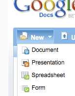

Step 2:
Click the "New" dropdown button on the upper left - and choose "Form".

You'll be taken to a new window which is the "Form Editor". It starts you off with an automatic first question called "Name" - just to remind you that you may want to ask (optionally) for the respondants name - and leaves you in edit mode on question #2.
When editing the form - you edit one question at a time (click the pencil button on the right) and click "done" as you finish setting up each question.

At this point you can go back and edit the first question (example - add some help text to tell people that "Name is optional, but helps me know who you are").

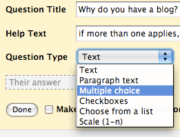
The default field type is "Text" - but you *should* use multiple choice or scale questions where possible - as those give great quantitative summaries - and if you want people to type a more descriptive answer, change the question type to "paragraph text".

Step 3:
Finish entering all your questions and click the "Save" button at the top. Keep the form rather short if possible - nobody likes to answer a long survey - and you won't want your second survey to be ignored if you decide to do another one in a few weeks/months.

Step 4:
Make your own confirmation message. After someone responds to your form, they get a generic "Thanks!" message - but you can edit that to create your own message. 
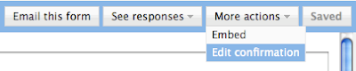
You can include valid URLs to have a link on that page. At the top of the form editor, there is a "More Actions" button. Click that and select the option "Edit Confirmation".

Step 5:
Send the form! You have a few ways to get the form into the hands of your potential respondents:
1 - Send the form using email... If you select the "email this form" option, you can enter the email addresses of respondents and they will get the form EMBEDDED in their email message if they use Gmail or Yahoo mail (those are the only popular mail systems which allow that) - or - they will get a link to a separate web page which contains your form.
2 - Embed the form on your blog or website. The other option in the "more actions" button is "embed" - that gives you the HTML code you can embed in your blog post, blog template or website so people can answer the form directly from there.
3 - Get the URL of the form and IM/mail it directly to your potential respondents. The URL can be copied from the bottom of the form editor screen, where it says "You can view the published form here:".

Step 6:
Go see your form. Click on that link at the bottom of the Form Editor to make sure your form looks as you intended. That's how others will see it. [NOTE: You can test the form, but there is currently an issue where the form response count will not be reset, even if you remove your test response]

Step 7:
See your responses! The form you created actually created a spreadsheet in the background. After saving your form - close that form editor window and go back to your Google Docs list. Find your form/spreadsheet on the docs list and click it to open it. You'll see a spreadsheet with the questions you asked as the column headers (with one additional column as the first, which is the timestamp of each reply). If you already sent the form out, the spreadsheet may already contain responses which have been received. If you hang out there for a while, you may even see responses appear in real time (that's fun).
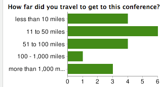

Step 8:

See your reponse summary. From the spreadsheet, click on the "Form" menu at the top and click on "Show Summary". That takes you to a page which summarizes, in chart format where feasible, the responses to each question.

Step 9:
Set up notifications so that you know when people respond to your form.
Click the "Share" button (on the upper right of the spreadsheet window) and select "Set notification rules". In that dialog, select the options "[when] A user submits a form", and choose either "Email - dialy digest" or "Email - right away", depending on how many responses you expect to get and how much you want to spam yourself.

Some Tips:

> *Do not* try to re-arrange the questions on the spreadsheet itself. There are issues where the form and the spreadsheet get out of sync if you do that. Re-arranging should be done from the form editor only - where questions can be dragged and dropped into the order you want them.

> There is not yet a way to restrict people to filling out the form only once.

> *Do not* "PUBLISH" the resulting spreadsheet or set it to "Anyone can view" unless that's really what you need. Those settings are NOT necessary to make the form broadly available, and it might let people see the results of the survey which you may not have intended.

> If you are HTML-ready, you can take the Form page and tweak the HTML to give it style or additional logic - just *never* change the POST URL or the NAME ATTRIBUTES on the HTML form object in that page. You'll also need your own place to host the updated HTML page. This isn't something you'll be able to get much support on from the Google Docs help center - so only do this if you are feeling lucky ;)

Have fun!

Tuesday, February 3, 2009

Small Business Summit in NYC


I attended the Small Business Summit in NY yesterday. Met many great people and had an opportunity to be on a Panel with Michael Shultz (Microsoft) and Harry Brooks (Network Solutions) moderated by Brent Leary (CRM Essentials and Business Technology Radio). I Had a chance to express some of my thoughts about how web-based social media and collaboration tools create opportunities for people to "keep and nurture loyal customers" (that was the official title - though we covered a wider set of concepts). Also got some great reminders about what small business focus on every day - and in particular, the importance of the search and ads side of the web. That stuff is highest on the small businesses "need to know, need to improve" list in most cases. More coverage of the conference can be found here.

There were a couple of points made during and after our panel which probably warrant more instruction and link or two for those of you who couldn't understand my babbling and happen to find me here... Here's two I can think of - but ping me here if there were others.

Create a Form on Google Docs
I suggested that you "Poll your customers and get their opinions directly and immediately [into a spreadsheet]"... Here's a link to the Google Docs Help Center on that topic. I'm also going to post a quick how-to here on my blog soon, since so many people have asked me for detailed instructions and a sample. (look for that soon)
[Update Feb 5: Here's that "Creating Forms" web tip post]

Use YouTube to collect videos about your product or service
I mentioned how you can create a channel on YouTube to collect videos about a specific topic, which could be useful for prospective customers, particularly when current customers have created those videos. We did that on the Google Docs team - we created the Google Docs Community channel. It's good for customers, for discovery and for the video creators who want more views/exposure.

Saturday, January 31, 2009

Last Minute, Automated-ish, Superbowl Pool


It's the Saturday before Superbowl Sunday - and you wish you had created a box pool for you and your friends. Too late, right? Nah... anything is possible... (if you've never been in a superbowl box pool - either stop reading or read on to check it out).

Here's an online way to do it (I know there are "real" sites for this): I created a SuperBowl Box Pool spreadsheet which has an online FORM for people to quickly participate... People fill out the form and they get assigned a random box in the pool - then, when all boxes are taken (there's 100 boxes, so it's ok to take more than one), the score values are randomly assigned and the names are again shuffled...
Then, as I enter the scores at the end of each quarter, the winners are identified automatically (as if that would be too hard to do by hand - sometimes I'm almost pathetic in my need to create useless spreadsheet formulas)

If you want to play in my pool (just for fun... no "points" to be won here!), just FILL OUT MY FORM and then go SEE THE BOX POOL to see which random boxes.

If you want your own - just go to THE SAMPLE and make your own copy (File menu, "create a copy" option... you'll need a Google Docs account).

If I get 100 boxes filled, I'll post the winner here after the Superbowl!

[Update: If you use the sample to run one of these on your own, be careful once the box numbers are generated... as they could easily be re-generated in-advertently if a change is made to the sheet which forces a re-calc - like inserting columns or other things. This shouldn't impact anything until you generate the random score numbers ... Once you take that startup step as per the instructions, don't touch the thing except to enter scores ;) and PRINT IT to be sure... ]

[Update 2/2/2008: And the winner was - Curious George. I would have won the half-time score, which is no wonder since I had to take almost half the boxes between myself and people close enough that they may as well have been me... Well - maybe I'll start collecting players for 2010 ;) ]

Thursday, January 29, 2009

Losing a friend is less fun

When I first added Friend Connect to my blog it was fun watching as people (slowly) became "members" of my blog, and how some of them became my "friends". The number of people in both those groups is rather small, but the latter (friends) group is really, really small - so small in fact, that when my favorite blogger "un-friended" me (ouch!), I noticed pretty fast. Was it something I said? Nah - can't be - as I haven't said much of anything here in too long... Aha! That's it! What could be more offensive to a prolific blogger than a blog which sits there in silence? I get it.
Ok - you've made your point. I promise to post more. Can we be friends again? Oh, this is tricky... you have so many Friend Connect members on your site (2858... er... 2859..) that I can't find you to formally ask you back. hmmm... oh wait - there you are! You are still on my blog's easy to browse (read: short) members list... whew... Tricky business this friends 2.0 stuff.